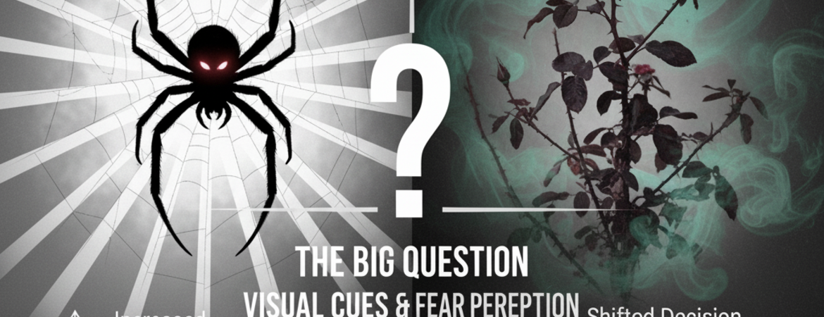
Have you ever noticed how a scary scene can look more frightening depending on how bright, dark, or colorful it is? This paper explores how basic visual features like contrast and color change our perception of the scariness of a scene. This is important because our ability to quickly recognize danger in our life, like spotting a bloody scene or a venomous spider, can impact our survival. The researchers in this paper emphasized something called signal detection theory or SDT. This approach separates whether people are truly better at distinguishing scary versus non-scary images (sensitivity) and whether they tend to label images as “scary” or “not scary” in general (decision criterion). Their findings help us understand how the brain processes emotional information and which visual features influence our feelings more.
How the Study Worked
The researchers worked with 109 Dartmouth College students, splitting them into two groups: one tested the effect of contrast on fear ratings, and the other tested the effect of color. The researchers used a series of 157 non-facial, fear inducing, colorful pictures, and adjusted them all to gray scale. Half of the gray scale images were then converted into low and high contrast. The color experiment solely used gray and color images; high and low contrast images were used for the contrast experiment. All in all, each group was presented with two categories of images; color and gray scale for color effects, and high and low contrast images for contrast effects.
What Did They Find?
The main interpretation from the results is that contrast and color affect fear in different ways. Using signal detection theory, the researchers identified how high contrast made people better at telling the difference between fearful and non-fearful images, improving sensitivity towards fear. However, the amount of contrast didn’t change if people decided to call an image fearful. Adding color to an image had the opposite effect as it didn’t make people more accurate in describing what was scary, but it shifted the decision criterion, making them rate more images as scary overall. Essentially, contrast helps with detection while color affects judgment.
The Takeaway
This paper found that people who looked at pictures with higher contrast are better at perceiving scary pictures in comparison to non-scary pictures. Contrast did not change how likely people were to think something is scary. Color changed people’s judgements by making them more likely to rate a picture as scary but not better at telling apart scary vs. not scary pictures. Through signal detection theory, the study showed the difference between perceiving fear from visual features and deciding whether to label something as fearful as opposed to not. In other words, the brightness, darkness, or even colors around us don’t just change how things look but change how frightening they seem. This study helps explain why certain media and environments can feel more threatening depending on how they’re being presented. This study can help us determine and understand how color and contrast can affect emotions which are relevant for mental health, survival and safety purposes.
Link to paper: https://www.frontiersin.org/journals/psychology/articles/10.3389/fpsyg.2015.01521/full